bmjhayward blog and writings
I write about science and technology, mostly. I live in Newcastle Australia and try to enjoy the good moments.
Facetting
Facetting is the simple technique of taking your plots, shrinking them a bit and putting them in a grid.
A 3x4 facet grid from plotly:
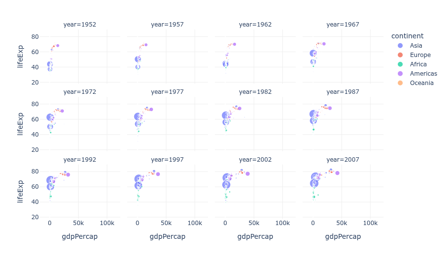 Credit: Plotly, https://plotly.com/python/facet-plots/
So now you can look at them all in one glance without turning, scrolling or re-loading a page. Usually it’s for plots of the same type but with a variable changed for at least one axis, but it doesn’t have to be.
A 4x4 using ggplot, where each border represents a different variable:
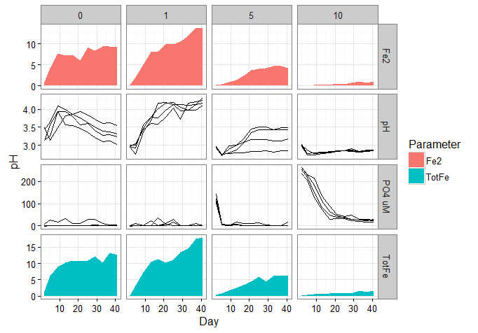 Credit: Stack Overflow, https://stackoverflow.com/questions/37337068/ggplot-combine-line-and-area-in-same-panel-facet-grid
Perhaps not a facet, as it’s only 2 plots - but your facet grid could contain multiple chart types if you want:
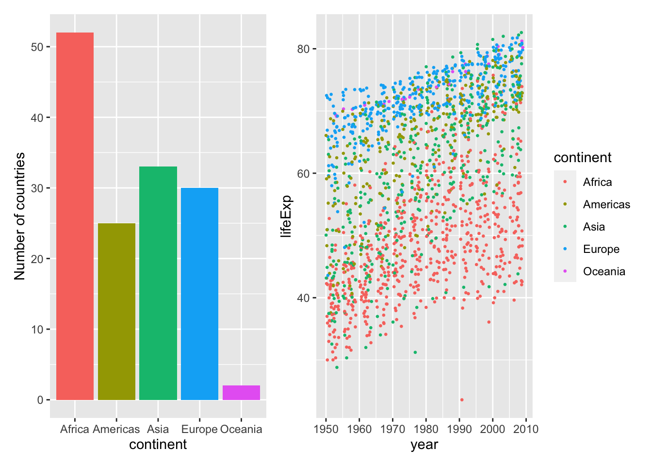 Credit: andrewirwin.github.io, https://andrewirwin.github.io/data-visualization/facets.html
- simple and effective technique
- increases information density i.e. saying more to your audience (T.Munzner should have some data on this)
- with only a little increase in cognitive load i.e. your audience doesn’t have to think a lot harder
- can use with any plot type
- can get an overview quickly and navigate data quickly at once
It’s a very useful high-level starting point in a data tool to navigate really quickly without any typing or clicking to change filters. Just pick the plot you want, click it to load a more detailed view or an entirely different report/dashboard. Of course this takes work to set up, but saves time straight away, and it’s an intuitive interface - no learning curve.
How to make a facet plot with excel:
- Make all your plots
- Shrink them and copy/paste them next to each other on a power point slide
- …
- Profit!
Honestly don’t know if there is an official way to do this in Excel. I asked an AI, it told be to buy a google subscription. It also started its response with “Hmm,…” so I’ll be subtracting points for that. However you can do it in PowerBI, using data from excel. See here: https://support.microsoft.com/en-us/office/create-and-share-a-dashboard-with-excel-and-microsoft-groups-ad92a34d-38d0-4fdd-b8b1-58379aae746e
Oh wait, you want to actually write some code and process the data all by yourself??!!??? Well then, see below…
Easy place to start is python with the seaborn library and the iris dataset. This is an example from a larger tutorial, link below.
# Import seaborn
import seaborn as sns

# Apply the default theme
sns.set_theme()
# Load the iris dataset for examples
iris = sns.load_dataset("iris")

g = sns.PairGrid(iris, hue="species")
g.map_diag(sns.histplot)
g.map_offdiag(sns.scatterplot)
g.add_legend()

# save a png file of your plot in the location you ran this code
g.savefig('facetexample4.png')
4x4 grid from the code above:
Credit: Seaborn from PyData, https://seaborn.pydata.org/tutorial/axis_grids.html
So there you go, a straightforward, bang-for-your-buck technique that is sensible for all audiences and makes you look smart.